Ongoing customer research helps company respond quickly to cancellations


The challenge
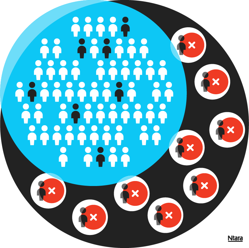
A global software company wanted to understand why some customers were canceling their subscriptions. They had strong customer segmentation data and a good understanding of their customers’ wants and needs.
But they needed to find out why customers were cancelling—and develop a plan to win them back. They also wanted to learn about cancellers who didn’t plan to resubscribe in the future. What was the reason for cancelling? Were they switching to be a with a competitor? The results would have a far-reaching impact on their success going forward.
Our approach
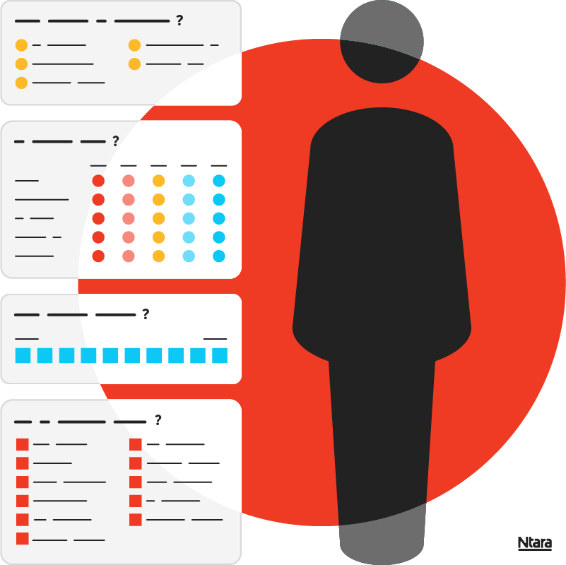
First, we gathered qualitative information from their team to inform our surveys. Because this client already had so much customer data, we were able to target our surveys to make them brief and personalized. Each cancellation triggered a survey send. Recipients could respond by filling out a quick survey, or by scheduling an interview with an analyst to discuss their reasoning over the phone (or both!).
Most importantly, we wanted to understand their reason for cancelling. Our goal was to determine which reasons were controllable and which were not. From there, we helped our client build a strategy for reversing or preventing many of these cancellation types.

Final experience
Our survey analysis and optional phone interviews gave this client insights that were immediately actionable. We discovered the reasons for many cancellations and reported on their financial impact. Our client now has the data they need to determine where best to invest their funds. They’re also able to better predict and prevent cancellations.
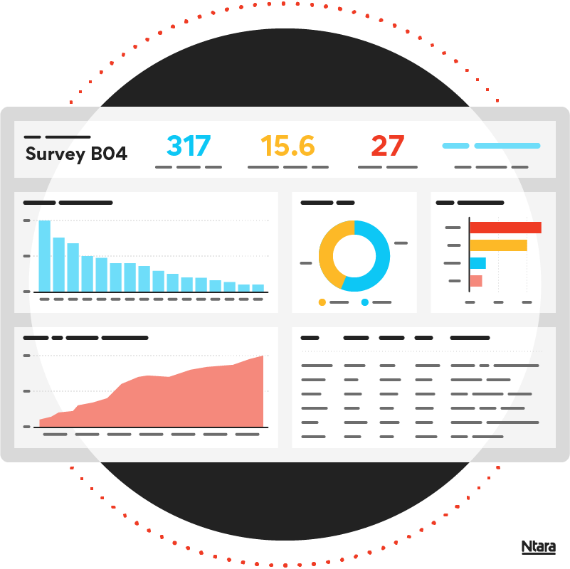
In addition to the survey readouts, we created a live dashboard that shows all the information they need to make improvements. The dashboard breaks down the details of each survey—response rate, who responded, why they canceled, and more. The dashboard can be shared with anyone throughout the organization—without the need for meetings or slide decks. Cross-functional users can filter dashboard data by date range, reason code, and persona to gain relevant insights. Since the project began, the company has expanded it from a small test group to all global locations.

By the numbers
4,200
completed surveys
236
phone interviews
23
page custom Power BI dashboard
This project illustrates the value of ongoing research. After the first three quarters of this continuous study, the client experienced a better return on investment, a stronger competitive advantage, and happier customers.
Schedule a call
Could customer research improve your ongoing strategies? Submit the form to schedule a no-pressure call.
