As a Platinum Partner with the Inriver product information management (PIM) system, our Inriver champions were thrilled to test many of its new features. Here are some of our favorite upgrades.
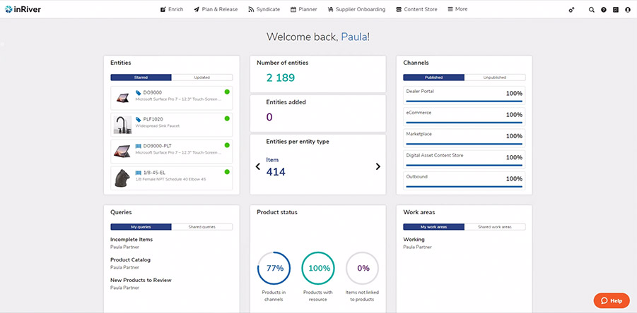
The new Inriver dashboard
Overall, the new UI is much more streamlined. The first screen you see after choosing your environment is a brand new dashboard. This view includes several widgets that give you a much better overview than the previous portal view allowed. Some widgets even have dual view states you can toggle for quick information.
The different applications (Enrich, Plan & Release, Syndicate, Control Center, and Content Store) are all easily seen and accessible in the top navigation. The addition of some global tools, such as Jobs, Create, Quick Search, Help (direct link to the Community), Tasks and User Settings, make for a much more streamlined user experience.
Enrich improvements
Many of the most significant changes can be seen inside the “Enrich” app, where you do most of your work with Inriver. The functionality is similar to the previous version, but it’s easier to use.
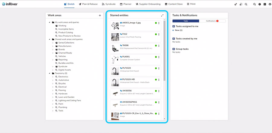
The dashboard for Enrich has a couple of small but welcome tweaks. The notifications have been consolidated into the same column as tasks on the right, leaving more room to see more of the work areas.
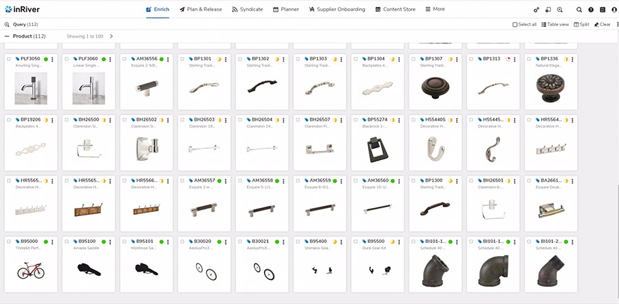
Our favorite modification to this screen has to be that the starred entities column in the middle now scrolls vertically and allows for all of the entities you have starred to be viewed. Also, you can maximize this view to fill the screen to see even more details about the starred entities.
Enrich Overview tab
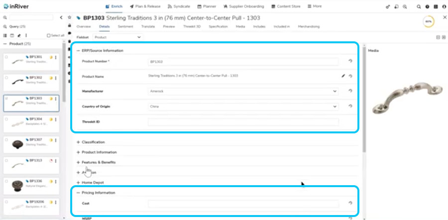
Visually, several things have changed within the Overview tab in the Enrich app. The whole screen can now be utilized for the interface if you maximize your browser. There is more room for the Overview data, making it easier to confirm you are looking at the correct entity after a search.
You can easily see how many entities there are, recent additions, and more without having to write a query like you would have in the past. It’s also nice that you no longer have to click on a dropdown menu to see the different applications.
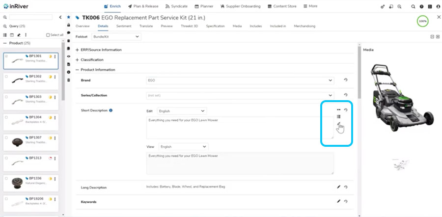
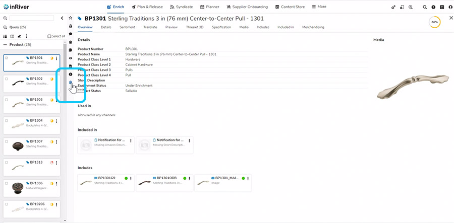
Images
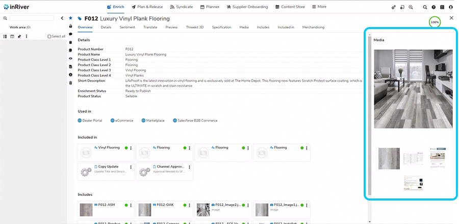
In the past, some clients have said they don’t like to work on enrichment without being able to see the images. The new UI has improved upon that issue, allowing users to view the available media in the Details tab while writing descriptions and editing data. Before, you would have to open two windows.
Also, you can now see a large version of your whole primary image while on the Overview and Details tabs. In this view, you still can see the “included in” and “includes” linkages, but there is more room to show you more of these from the Overview tab.
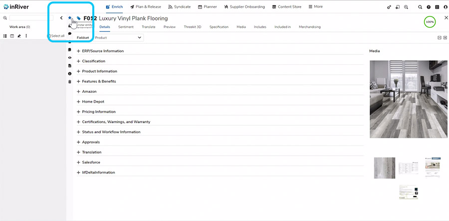
Pencil tools
The tools that previously lived inside the pencil icon are now always available instantly, right beside the interface main window, beside the work area results. This can reduce clicks and help users remember that those options are available to them.
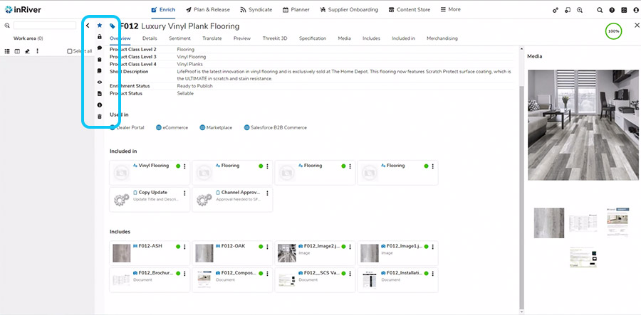
Starred entities
Here is something that might not be immediately noticeable but is a very welcome speed improvement. To star an entity in the old UI, you used to click the pencil, then the star. Now it is always visible when you are working. This means you can instantly star something with fewer clicks.
After clicking on a starred entity and landing on the Overview screen, all of the starred entities are populated in the work area column on the left. Since users often need to work on more than one starred entity in a session, this makes doing so quite a bit easier and faster.
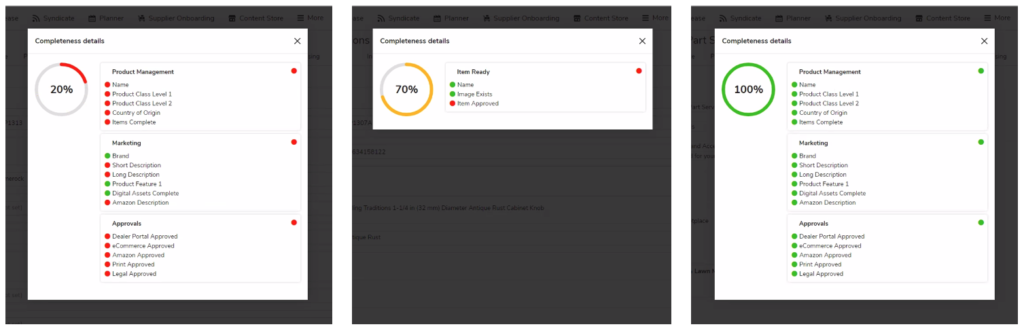
Completeness
With the new UI, the completeness rules graphic is shown as a color-coded pie chart. If an entity is not very enriched, it will show up red, if it’s halfway there, it will be yellow, and if it’s fully enriched, it will be green. This extra visual feedback is really helpful. Also, when you open the completeness list, it is color coded better than before and is easier to read and to scroll if necessary.
Controls
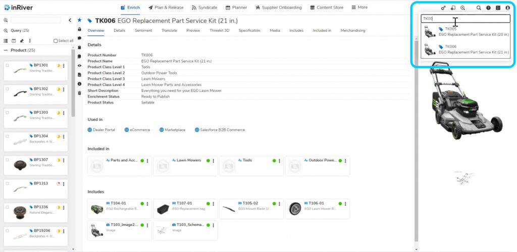
To search while in Enrich, find the magnifying glass in the top right corner. It takes a bit to get used to the new location and lack of the word “search,” but it’s consistent with where you’ll find other controls.
Translated data
When you utilize the different view icons on a locale string, the icons don’t jump around the interface anymore. They now stay in the same relative location, making it easier to work with them. With the updated UI, there is a lot more room to work with the content and you can more easily toggle into and out of edit mode.
“Includes” and “include in”
Before the updates, you had to scroll to find what you were looking for in these interfaces and it was easy to lose track within that single-column vertical scroll. In the new interface, you can see a lot more information at a glance and more easily spot check what needs work by identifying the yellow or red completeness icons.
Context menus
Instead of the old hamburger menu, you’ll see three vertical dots that are consistent across the new interface. The new icon takes up less space and provides more room for other information you need to be able to see.
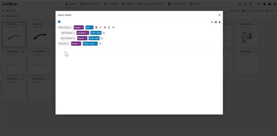
Query editor
The query editor used to be a bit hard to read. Now it’s color-coded, making it easier to see, click on, and change information. Like the search button, the query editor button is also in the top right corner for consistency. It is now a magnifying glass with a plus symbol in it.
Comparing fields
With the new interface, you can quickly see if data sets look the way you intended. You no longer have to “collapse all” to jump between groups of fields and move things out of your way each time you change entities. The categories you close stay closed, and the ones you open stay open when changing entities. This saves lots of time and clicks.
Trash can/delete button
In the old UI, the trash can button was in the middle of the controls and it was a little too easy to delete an entity and its associated data by accident. Now, this button is much more separate from other controls, so you have to be more deliberate about using it, which gives you peace of mind.
All Inriver clients are expected to be using the new UI by August 2021. Inriver will continue to release more information about this and training for customers on these and additional upcoming changes. From our perspective, these new UI updates enhance the overall Inriver user experience and will add substantial value to our PIM clients.
Want to discuss getting your organization into the new Inriver UI? Get in touch and one of our consultants will get back to you as soon as possible.