Optimizing Milbank’s homepage user experience

The challenge
Milbank is a renowned manufacturing company, specializing in the production of high-quality meter sockets, enclosed controls, commercial enclosures, and related products. They faced several challenges with their existing website homepage user experience.
It had become outdated and difficult to navigate, leading to a suboptimal user experience. The cluttered design and lack of user-friendly features made it particularly challenging for non-tech-savvy users to access product details, resulting in potential customers feeling overwhelmed and frustrated.
Thus, Milbank sought to revamp their homepage to better reflect their commitment to excellence and innovation while providing a seamless user experience for visitors.
Our approach
User-centric design
We conducted an in-depth analysis of Milbank’s target audience, considering both their technical proficiency and their needs when visiting the website. This insight helped inform a design that caters to both tech-savvy users and those less familiar with digital interfaces.
Simplified navigation
We restructured the homepage layout to present a clean and organized view of Milbank’s product offerings. Clear and concise navigation menus now guide users to the specific product categories of interest, making it easier to find and access relevant information.
Enhanced product display
To showcase Milbank’s product range effectively, we incorporated high-quality product imagery on the homepage. We also added prominent CTA buttons that direct users to dedicated product detail pages for more comprehensive information.
Responsive design
The redesigned homepage is now fully responsive. Now, whether users access the website from a desktop, tablet, or smartphone, they can enjoy a consistent and optimized browsing experience.
Company information
To establish a more personal connection with visitors, the homepage now presents key information about Milbank. This includes their history, mission, and commitment to quality – which also helps convey the company’s credibility.
Insightful blogs for SEO
Understanding the importance of engaging content, we added a dedicated section for users to read Milbank blogs. This provided valuable industry insights and positioned Milbank Works as a thought leader.
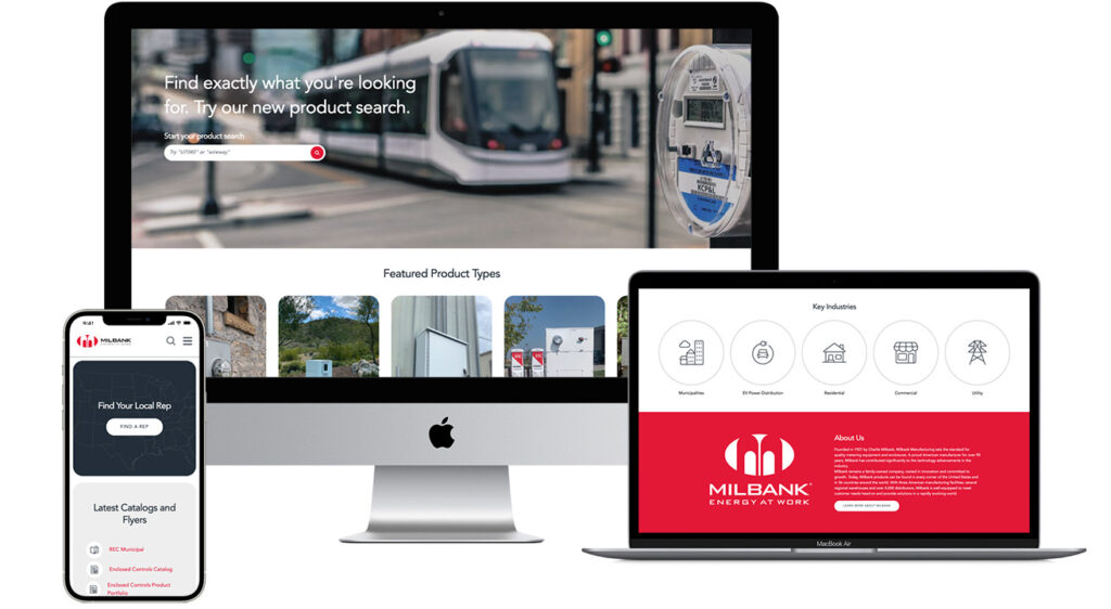
The final result
The collaboration between Milbank and our UX strategy team resulted in a modern, user-friendly, and more visually appealing homepage. Today, users who visit the website can find the valuable assets they seek to explore Milbank’s high-quality products.
By the numbers
208%
increase in clicks on the homepage
24.4%
increase in pageviews to product detail pages
8.5
percentage point decrease in bounce rate from the home page
Request a quote